
The Bitcoin Rainbow Chart is a visually intuitive tool that tracks Bitcoin’s price trends over time. It helps traders and investors understand whether Bitcoin is in an undervalued or overvalued state, making it easier to spot potential buying or selling opportunities.
How the Bitcoin Rainbow Chart Works
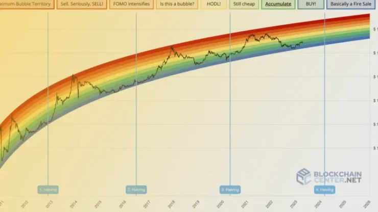
The Bitcoin Rainbow Chart is built on a logarithmic regression model, which creates a series of color-coded zones that represent different price ranges. Each color corresponds to a specific level of market conditions, ranging from undervalued to overvalued.
- Logarithmic scale: This scale helps visualize Bitcoin’s long-term price trends by smoothing out short-term volatility.
- Color-coded zones: Each zone indicates a different market condition, helping traders gauge whether Bitcoin is too expensive or potentially a good buying opportunity.
The Color-Coded Zones Explained
The Bitcoin Rainbow Chart uses several color zones to represent different price levels. Here’s a breakdown of the colors and what they mean:
- Red Zone: This zone indicates that Bitcoin is extremely overbought, and a price correction may be imminent.
- Orange Zone: In this zone, Bitcoin is highly valued but may still have some room for growth before reaching its peak.
- Yellow/Green Zones: These zones represent fair market conditions, where Bitcoin is neither undervalued nor overvalued.
- Blue Zones: A blue zone indicates that Bitcoin is undervalued, suggesting it might be a good buying opportunity.
- Violet Zone: This zone represents the lowest price levels historically, often seen as an extreme undervaluation and potential long-term buying opportunity.
Historical Accuracy of the Bitcoin Rainbow Chart
The Bitcoin Rainbow Chart is based on Bitcoin’s historical price data, which means its accuracy is rooted in past trends. While the chart offers valuable insights into Bitcoin’s long-term price cycles, it’s not a predictive tool.
- Historical trends: The chart is grounded in Bitcoin’s past price behavior, showing how Bitcoin has reacted during similar market conditions.
- Past performance: While past data offers guidance, it doesn’t guarantee future outcomes, especially in such a volatile market.
How to Use the Bitcoin Rainbow Chart for Trading
The Bitcoin Rainbow Chart is a valuable tool for traders looking to time their market entries and exits. Here’s how it can help:
- Identify buying opportunities: When Bitcoin enters the blue or violet zones, it might signal that the cryptocurrency is undervalued and could be a good time to buy.
- Spot overvalued conditions: If Bitcoin reaches the red or orange zones, it suggests overvaluation, and traders may consider selling or taking profits.
- Long-term perspective: The chart can also be used for long-term trend analysis, helping traders and investors assess Bitcoin’s price relative to past cycle.

Limitations of the Bitcoin Rainbow Chart
While the Bitcoin Rainbow Chart is a helpful tool, it does have its limitations. It’s important to recognize that it’s not a perfect predictor of price movements.
- Not a short-term predictor: The chart is based on long-term trends and doesn’t provide short-term predictions.
- Market cycles change: Bitcoin’s market behavior may not always follow the same cycles, especially with new market dynamics or macroeconomic changes.
- Lack of fundamentals: The chart doesn’t take into account important factors like technological updates or regulatory shifts that could impact Bitcoin’s price.
Other Tools to Use with the Bitcoin Rainbow Chart
To enhance the Bitcoin Rainbow Chart’s effectiveness, many traders combine it with other technical analysis tools. Some of them are:
- Moving averages: Tools like the 50-day and 200-day moving averages can help identify broader market trends and validate the signals from the Rainbow Chart.
- RSI (Relative Strength Index): The RSI helps determine if Bitcoin is overbought or oversold, which can complement the signals from the Rainbow Chart.
- Volume analysis: Tracking trading volumes can offer additional context about the strength of price moves.
Bitcoin Rainbow Chart vs. Other Technical Indicators
While the Bitcoin Rainbow Chart is an intuitive tool, it is only one method of analyzing Bitcoin’s price trends. Comparing it to other common technical indicators can offer further insight.
- Moving averages: Moving averages (like the 50-day or 200-day) help identify the overall direction of the market. Combined with the Rainbow Chart, moving averages can confirm whether Bitcoin is entering a bullish or bearish phase.
- MACD (Moving Average Convergence Divergence): The MACD can give traders information about price momentum, providing complementary signals to the Rainbow Chart.
- RSI: The RSI measures whether Bitcoin is overbought or oversold, which can serve as a confirmation when Bitcoin enters the extremes of the Rainbow Chart’s zones.
How Accurate is the Bitcoin Rainbow Chart in Predicting Price Trends?
The accuracy of the Bitcoin Rainbow Chart in predicting price trends is a subject of debate. While it is a valuable tool for understanding Bitcoin’s historical market cycles, it does not guarantee future results.
- Market conditions evolve: The cryptocurrency market is dynamic and influenced by various external factors, which may cause Bitcoin to deviate from past trends.
- Long-term guidance: The chart works best as a tool for identifying long-term trends rather than for short-term price predictions.
Traders need to combine the Bitcoin Rainbow Chart with other tools and stay updated on market news and trends to make well-informed decisions.
Conclusion
The Bitcoin Rainbow Chart is a simple yet effective tool for understanding Bitcoin’s price history and market cycles. By using the color-coded zones, traders and investors can visually assess whether Bitcoin is overvalued or undervalued based on historical trends. Combined with other technical analysis tools, the Bitcoin Rainbow Chart can help users navigate the volatile world of cryptocurrency with greater confidence.